.png)

New Solution Launch - Logo Design
Qyrus recently launched QAPI, an AI-driven API test automation platform. Designed a logo and mascot to represent innovation and efficiency. The aim was to create a simple yet powerful visual identity that communicates the core message: "Unlock API, Start, New Beginning, Future."
Design Process

Initial Concept
The initial concept was to create a logo that was clean, modern, and easily recognizable. The focus was on simplicity, ensuring the design would be versatile and scalable across different media.
Color Palette
We chose a vibrant color palette featuring shades of green (#46DF93) and lime (#CFF242) to represent growth, innovation, and energy. To convey a professional and trustworthy appearance, a deep navy blue (#130F33) enhances these colors.
Typography
The font "Black Future" was selected for its modern and sleek appearance. It aligns well with QAPI's technological aspect, providing a futuristic feel.
Logo Symbolism
The critical element of the logo is the stylized "Q," which resembles a start/power button. This symbolizes the beginning of a journey and the potential to boost work efficiency with QAPI. The design is kept minimalistic, focusing on clear, bold shapes.
WCAG Compliance
To ensure the logo and associated visual elements were accessible to all users, we adhered to the Web Content Accessibility Guidelines (WCAG). Key considerations included:
Color Contrast: Ensuring sufficient contrast between text and background colors to make the logo readable for visually impaired users.
Scalability: Designing the logo to be clear and recognizable at different sizes, ensuring it remains effective on various devices and screen resolutions.
Simplicity: Keeping the design simple and uncluttered to facilitate understanding and recognition.
Visual Elements
Primary Logo: The main logo features the "QAPI" text with the stylized "Q" at the beginning. The green and lime colors provide a fresh and dynamic look, while the dark navy adds depth and contrast.
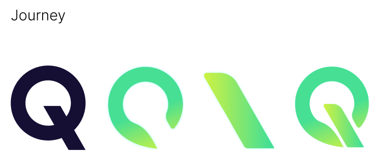
Journey Icons: A series of icons depicting the evolution of the "Q" from a simple circle to the final design. These icons represent the stages of development and growth.
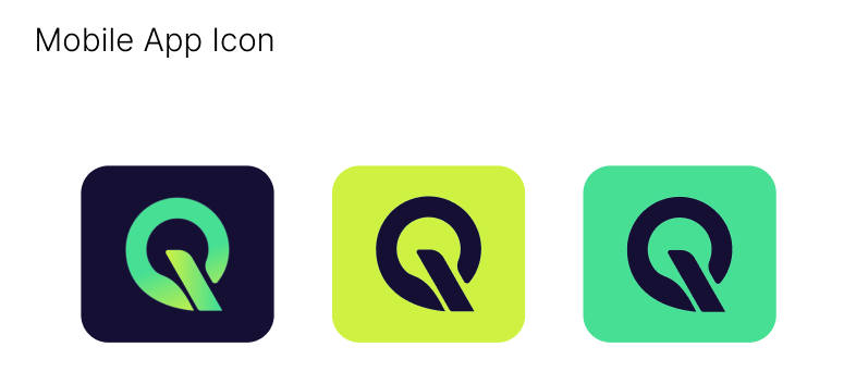
Mobile App Icon: Variations of the app icon in different color combinations ensure flexibility and adaptability across different platforms.
Implementation
The new logo and mascot design were implemented across various platforms, establishing a strong brand identity and reinforcing the product's key messages.
Project Gallery
